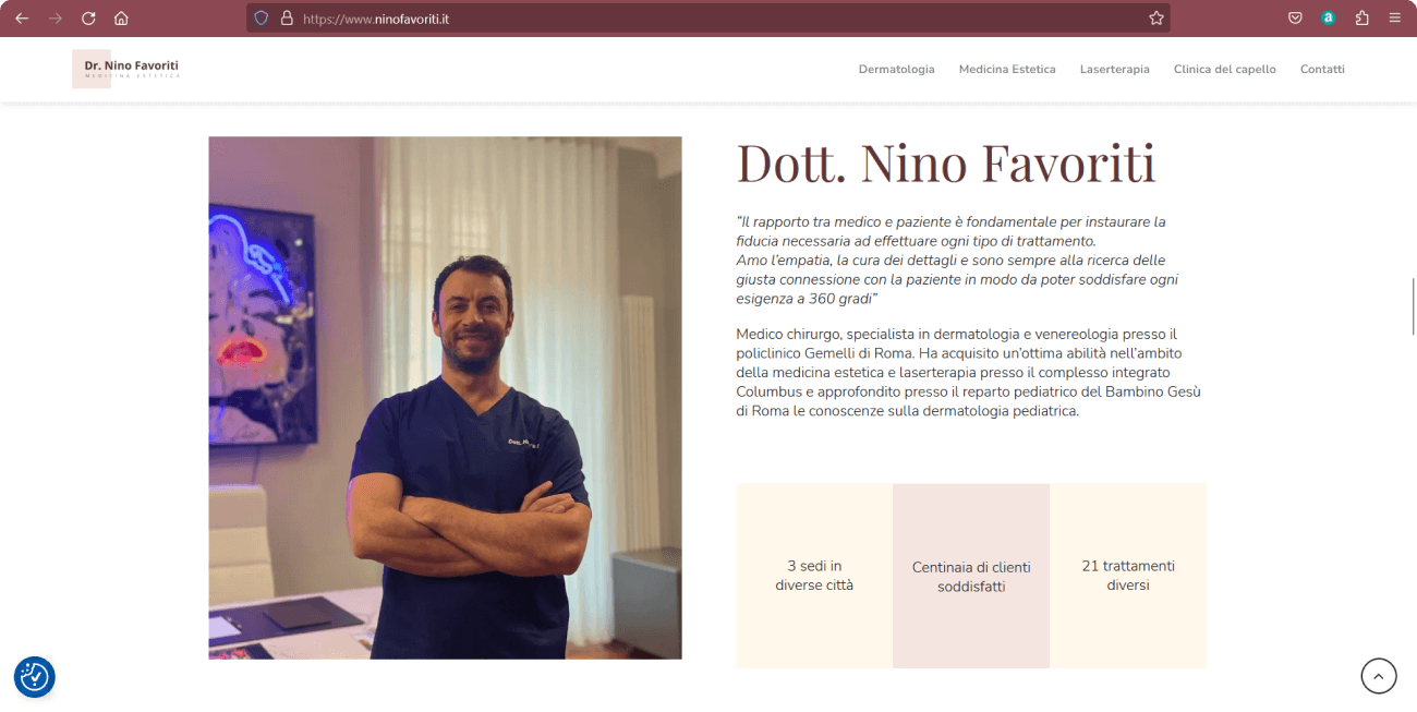
The goal of the project was to redesign the old site to make it more appealing to the target audience and more user-friendly. At the same time, it was necessary to maintain the original structure of the site and start from the already present brand identity.
Team Members Me, Antonio Ruscitti (product manager)
Tools Figma, Photoshop, Illustrator, Elementor
My role as a Designer
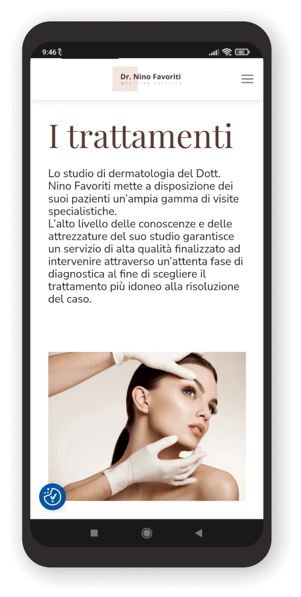
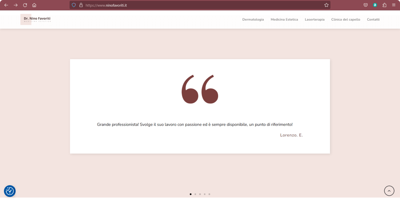
For this redesign, I started by studying the brand identity of Dr. Nino Favoriti and his competitors. After identifying a convincing palette and suitable fonts, I moved on to designing the wireframes and graphic design of the site. For the project, both continuous line and modified illustrations of pre-existing ones were created. However, during the development, it was decided to include photographs of models reworked in a creative way.
Palette
Footer
Titles
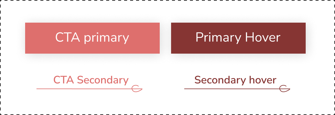
CTA
CTA Hover
Pink box
Yellow box
Typography Desktop
Buttons & Icons
The prototype evolution
Problem
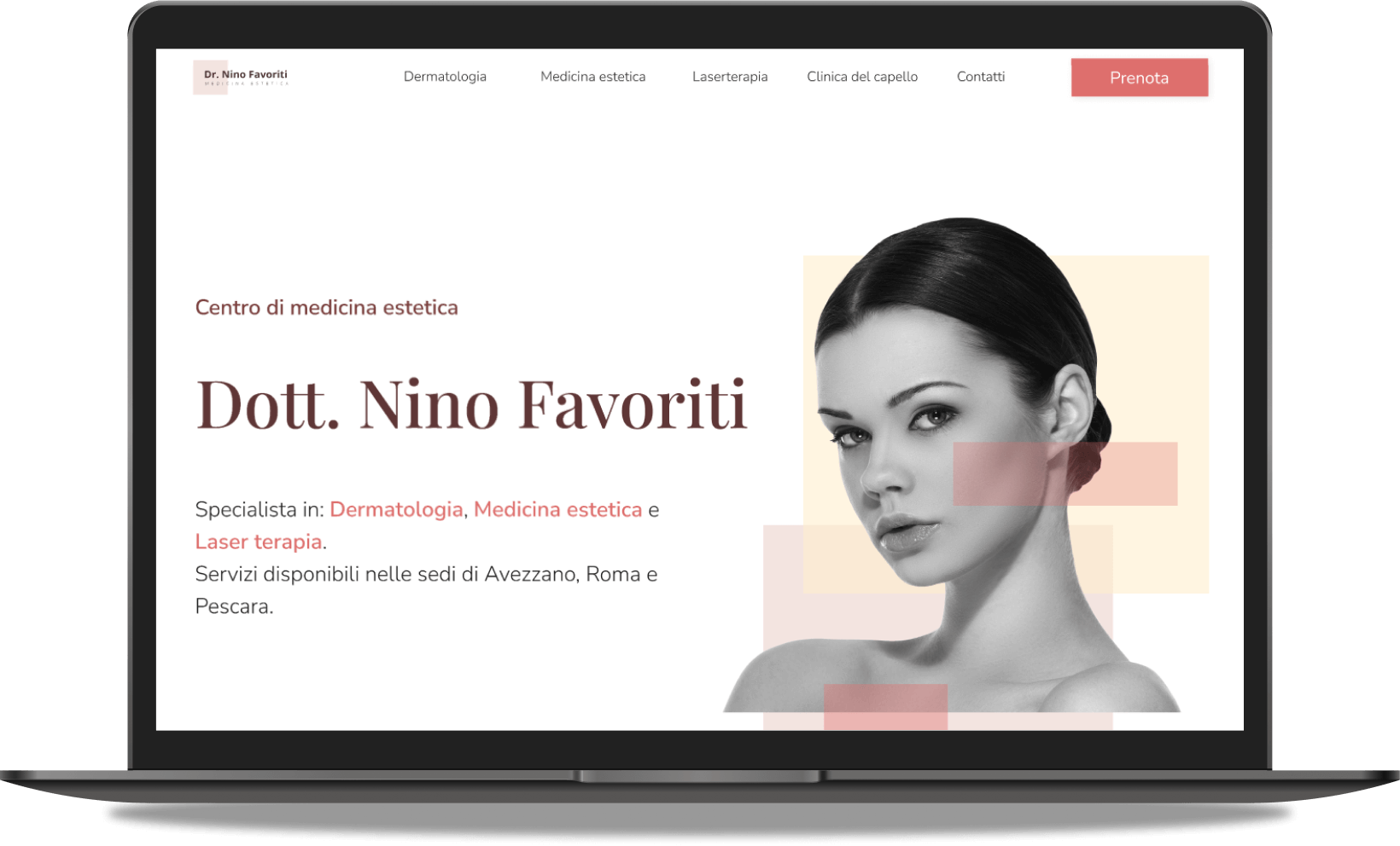
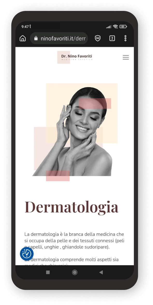
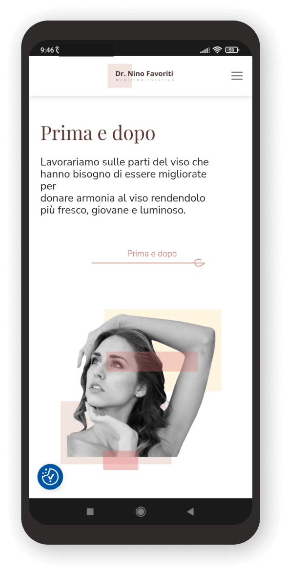
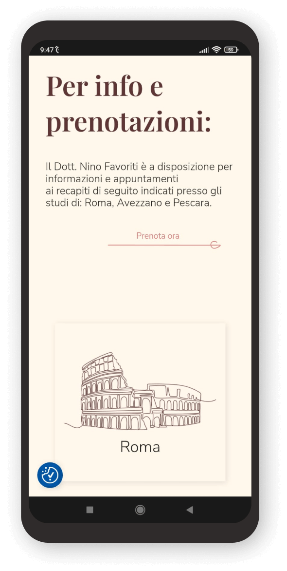
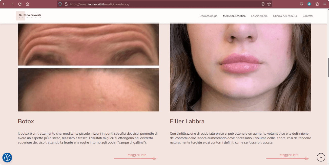
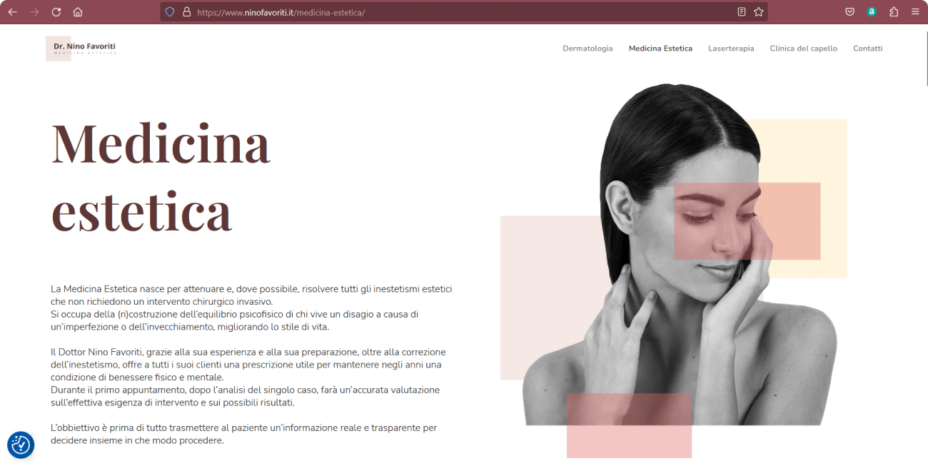
One of the characteristics that stand out in the study of competitors is the fact of always using the same stock images. For this reason, with the team, we decided to create and insert continuous line illustrations instead of photos. However, the client wanted some illustrations to be replaced by photographs, to better involve the user.
Opportunities
Since the specific photographs of the cosmetic medicine world are very limited, I thought I’d integrate the square lines of the brand identity to create points of interest in the images (to underline aspects of the face that are crucial for cosmetic surgery). In this way the starting material acquires higher quality and its own identity. However, some of the original illustrations have been retained to create a more original identity.
Illustrations and photos (before and after)
Thank You!
I hope this project has aroused your interest and has fascinated you