Brand identity project created for Graphic design exam of Start2impact

The creation of a brand identity for Thime aims to communicate the quality and freshness of the products offered by the brand. The design of the logo and visual elements should be able to convey the idea of natural and healthy products, carefully selected with attention to detail.
In addition, the brand identity must be recognizable and memorable, in order to distinguish Thime from its competitors and create an emotional connection with customers.
Tools
Figma, Photoshop, Illustrator

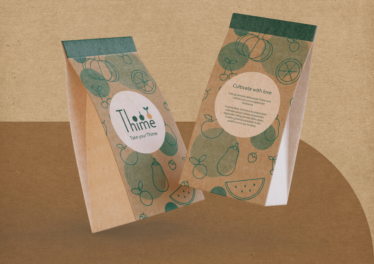
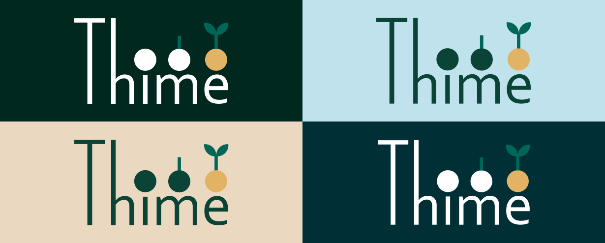
For the logo, I extended the upper stems of the Corbel font sticks and combined it with the purity of geometric shapes to ideate the brand. The name I chose is a combination of “Thyme” with the English word “Time”.
Thyme, being a Mediterranean plant, emphasizes the company’s connection to the national territory and its commitment to only trade products at km0. The reference to time instead refers to Thyme’s policy, committed to reclaiming natural cultivation times and methods.


Verde Foresta
Salvia scuro
Blu Selva
Azzurro chiaro
Giall Sole
