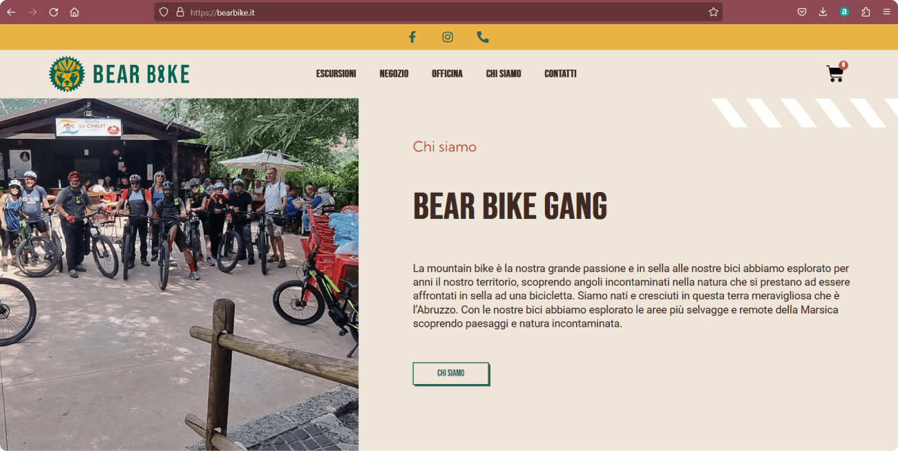
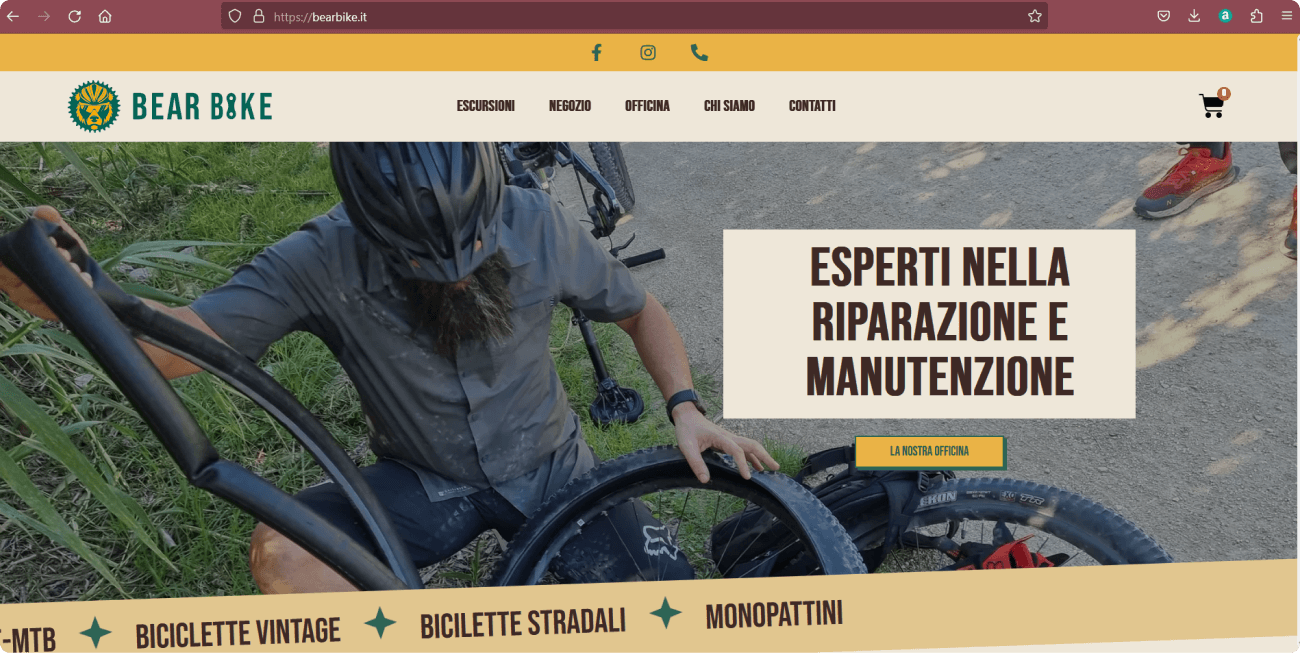
Client: Bike tour operator, mechanic and bike seller
The Goal
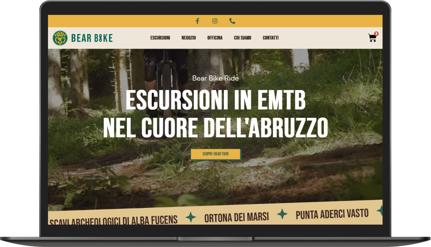
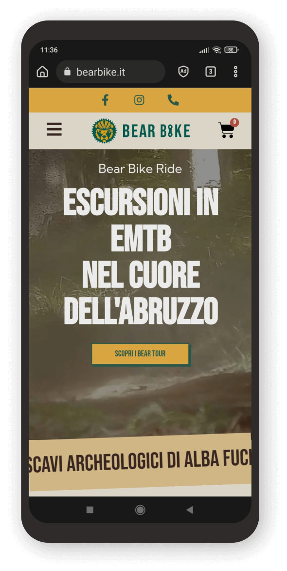
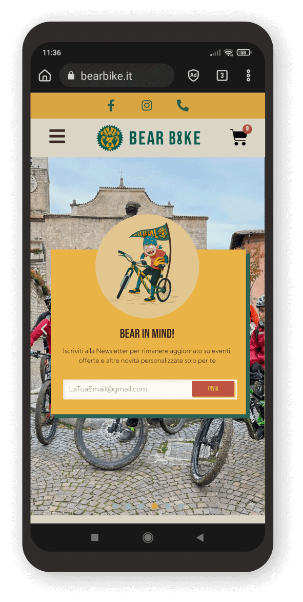
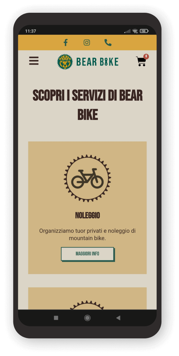
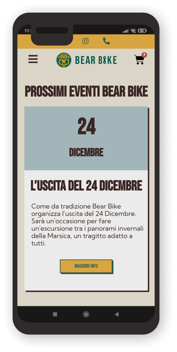
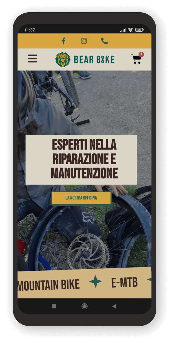
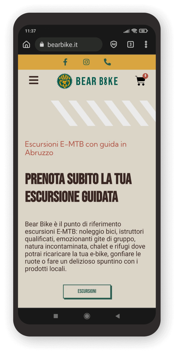
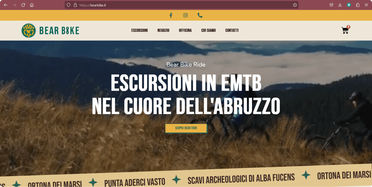
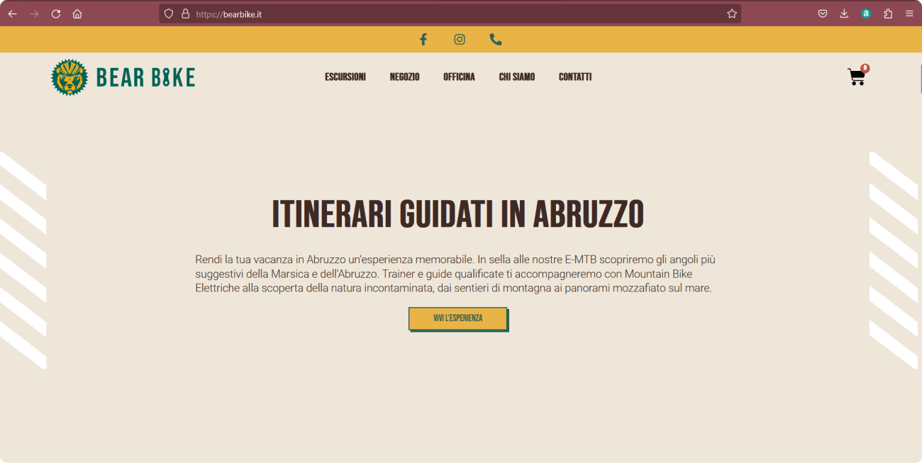
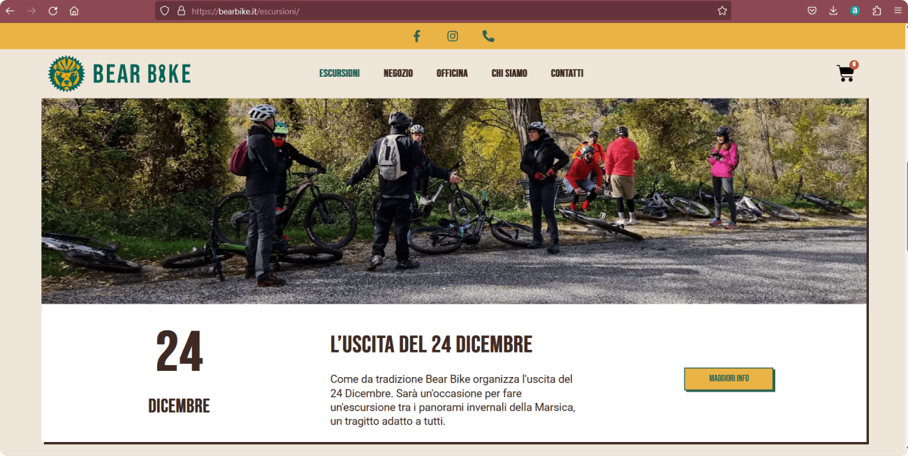
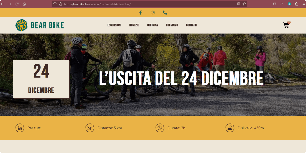
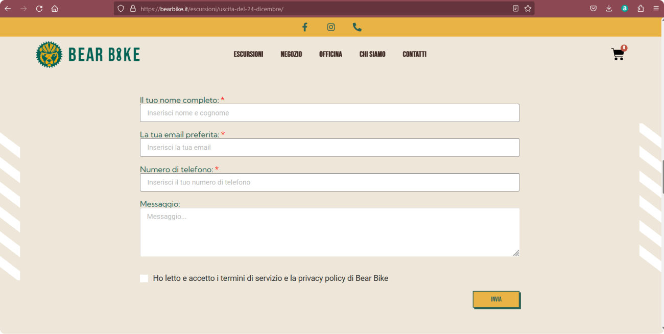
Making navigation effective but at the same time fun, dynamic and familiar to the world of mountain bikers. Create a platform, easy to use and with an intuitive infographic, which would allow both the booking of excursions and the purchase of high-end bikes.
Team Members Me, Antonio Ruscitti (product manager)
Tools Figma, Photoshop, Elementor, WooCommerce
My role as a Designer
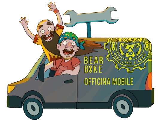
After studying the competitors and preparing the appropriate references, I outlined the wireframes and user paths so that navigation was smooth and intuitive. Later, I designed the style and palette of the interface and also drew the internal illustrations.
Throughout the process I stayed in touch with the team, working in synergy, to find and design the ideal solutions for the customer.
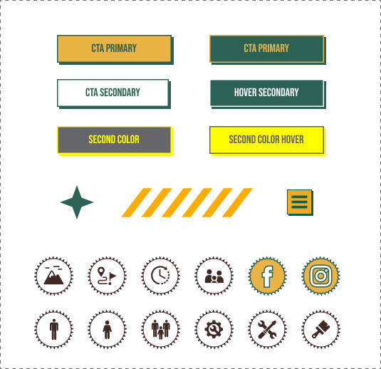
Buttons & Icons
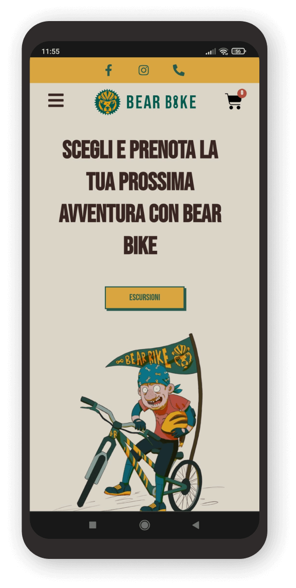
Illustrations
Palette
Solar Yellow
Reddish Soil
Verde Selva
Deep Soil
Warm Snow
Typography Desktop
Typography Mobile
The prototype evolution
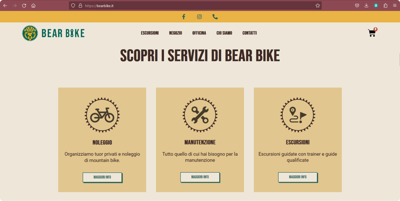
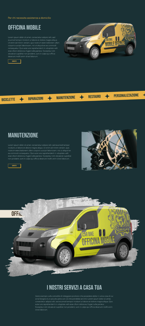
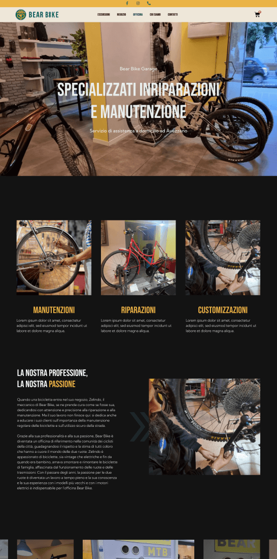
Problem
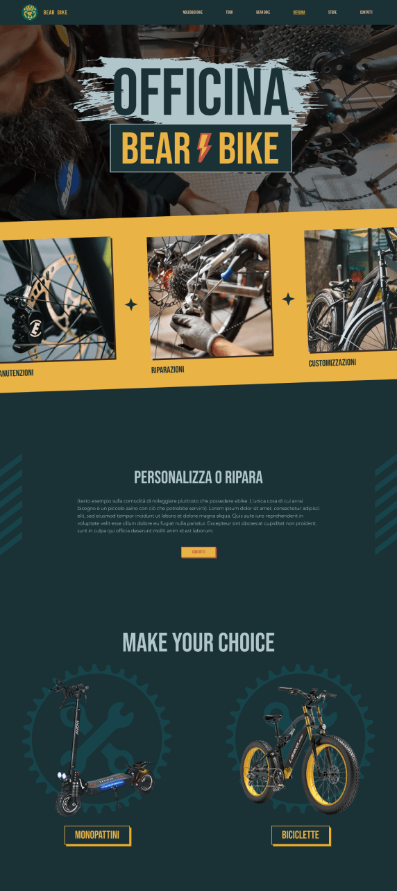
After discussing with the customer and the team project, I started to think for a second version of the Officine page, so that it better reflected the target and that the architecture was more engaging and effective.
On the right, the first version of the Officine page.
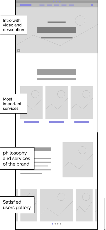
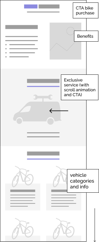
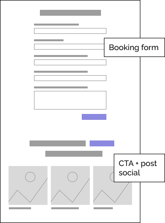
Opportunities
So I started from the conception of the low-fidelity wireframes to define the areas of interest, the CTAs and the architecture of the page.